The Amsterdam Data Project #01
Counting to a Million
Data, Concept, coding, design, animation
Public Data Sculpture.

A data sculpture tracking and predicting 50 years of Amsterdam population growth. Exploring births, deaths and changes in each suburb's population count as the city heads towards a million residents. The sculpture blurs the lines between suburbs, crosses boundries, and merges together in a constant push and pull, ebb and flow, as life happens, people move, die, get married and new residents arrive and are born.
I've always ben fascinated with big public data, as an input and source to create artworks, so was super excited to be able to create Amsterdam Data Project, part of a year long exploration into the wonderful world of open data in Amsterdam.

The Making of Counting to a Million:
I am really grateful for the folks at Ngage Media, the Netherlands' leading network in Out of Home digital screens who made this happen and specifically Ngage's Daan Krijnen.I met Daan a year earlier at Refik Anandol's Architectural Intelligence Lab at the Fiber Festival in Amsterdam. Daan showed me the beautful giant screens at Amsterdam Central Station and I immediately fell in love with them and salivated at the chance to do something on them. He mentioned to me that Ngage were wanting to do some experimental public art projects on them, and after a few months of to-ing and fro-ing we were able to get the project underway.
The remit of the project is to create a new data sculpture every month for six months, with the option to do another six months, using data to create artworks across the Nethwerlands, on Ngage's giant media screens. Amsterdam Population Growth - Counting to a Million, was the first.
The data sculptures were coded completely in Javascript, using libraries I've been developing over the past few years from my #Code365 project. The data was obtained from the wonderful data.amsterdam.nl and thanks to the kind and generous help from Jasper Soetendal and DataLab Amsterdam. I spend a long time going through all the public data before settling on population growth.
Immigration and a changing Europe being such a hot topic these days, I thought it would be interesting to see how Amsterdam has changed over time. And what we could expect from the future. I've been travelling to Amsterdam for years, and have always been impressed by the city's openess and inclusiveness. Turns out Amsterdam's growth has been pretty normal, and I would say it's tourism that's shaping and changing Amsterdam and Europe more than anything else, but that's another topic- and perhaps data visualisation.
I mashed up the population data with Amsterdam Suburb data to create a location-specific data set that could be plotted on a Google Map. I might say this in a sentence, but this was a mountain of work to get the data looking and working in a way that I could start getting creative with it.
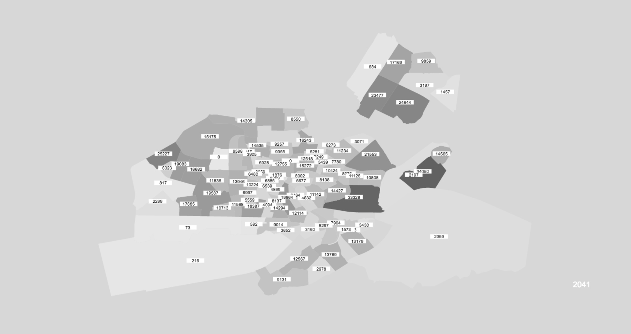
The data was then fed through a simple Machine Learning Neural Network to predict future population values, only to later discover Amsterdam had it's own (much better) predictions.
Population numbers were then normalised to be able to work with more easily, and to get a better feel of changes though time. I like to sit with data like this for a while and watch it and "get to know it".
I also plotted births and deaths in each suburb, as well and changes in population, but eventually decided on using the raw population dataset that gave me a good feel of how the population in Amsterdam had changed over time. Interestingly Amsterdam's population was shrinking in the early 90s.

I then built attactors into the artwork. Where larger amounts pulled other suburbs closer together, showing movement as suburbs grew and shrunk over time, forming metaballs around the most populous areas.
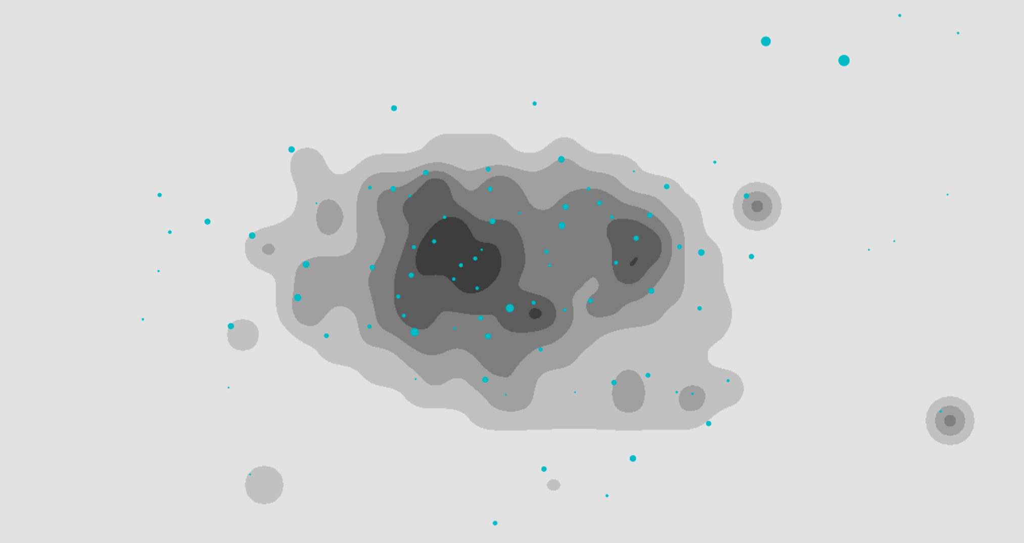
The visualisation was then blurred and posterised, all in Javascript, getting closer to the look and feel I was wanting. However, the it was also getting way too slow (blurring is crazy heavy of the processor). I wanted them to render in realtime and despite using all the tricks in the book, learned from my more than two years of daily CODE365 coding experiments, such rendering on smaller a hidden off-screen canvas, I was still unable to get the balance of reasonable frame rate.

So I went back to the drawing board, to mimic the behavior I wanted, by simplifying and making the visuals more graphic (a look that was always my endpoint anyway), merging data points that were close together, and harcoding some of the heavy map calculations. And finally the look I was wanting started to come together.

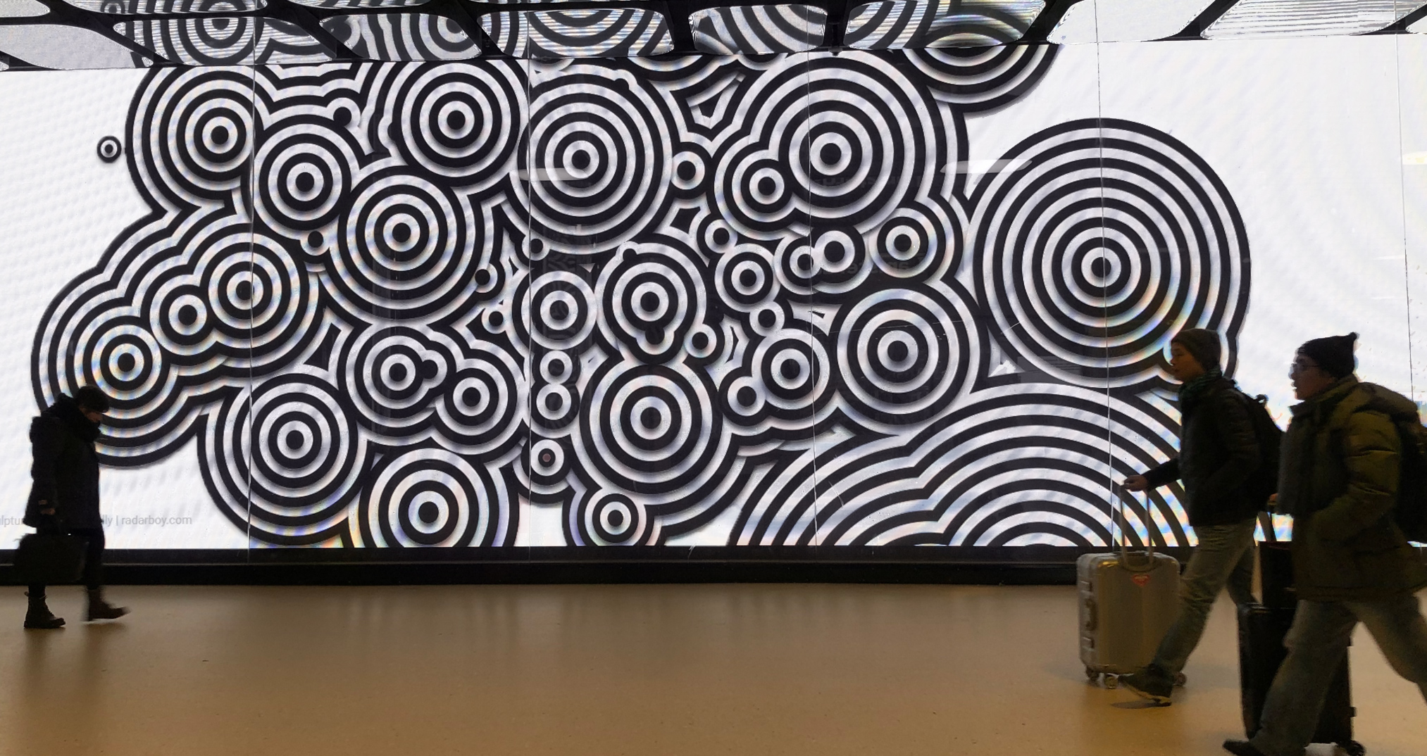
All that was needed then was animate the data and make adjustments for the various screensizes, some of which have weird dimensions - Amsterdam Centraal Station has a widescreen dimension of 2112x608pm. I also gave the visualtion a layers drop shadow to give it a more depth and a slight 3D effect.

A fed days before I was due to fly out to Amsterdam to test the visualtions on the screens my mac died. My backups were days old (yes I know, commit often) - meaning I had lost critical final tweaks to the work. Two different Apple Stores and an Apple service centre told me that the control board had fried, and would take a week plus and $500 plus to repair. I paid someone to retreive my data off my dead mac's hard disk and bought a new Mac, so I could test and show Daan my progress. We tested a few variations on the design and it was clear the more graphic ones worked better and though white backgrounds looked awesome - they were way too bright.
(Turned out Apple were completely wrong, despite me insiting that it wasn't the motherboard, and the battery, they insisted it was the motherboard. My new Macbook has also been giving me trouble since day one, with the battery lasting less than two hours. Apple again insisting there's nothing wrong. Hours of support calls. Visits to the Mac store. And eventually reformatting the computer have not solved anything. When I arrived in NY to get my new mac repaired, lo and behold the old one started up immediately in the Mac Store and turns out it was a battery problem after all. My new one in the meantime, can't be replaced, because it was bought in Amsterdam. And I'll havew to send it away for repair for a week - once my new one arrives. The only reason I bought a new one is because Apple told me my old one was dead. 100s of hours wasted. And only "sorry there's nothing we can do" from Apple. Rant over. Not really).
I'll be getting some better documentation of the live installation soon... But in the meantime, here's some more of the tests...

Amsterdam Counting to a Million is viewable January through July 2018 on the giant mediascreens at Amsterdam Centraal Station, Leidsplein and Amsterdam-Zuid WTC.
Special thanks to Ngage Media, the Netherlands' leading network in Out of Home digital screens and specifically Ngage's Daan Krijnen for supporting this project.